HomeServicesProjectsabout usContactmenu
Fashion / lifestyle

California Postcard Print for A Fish Named Fred – SS24 Collection

Project Details

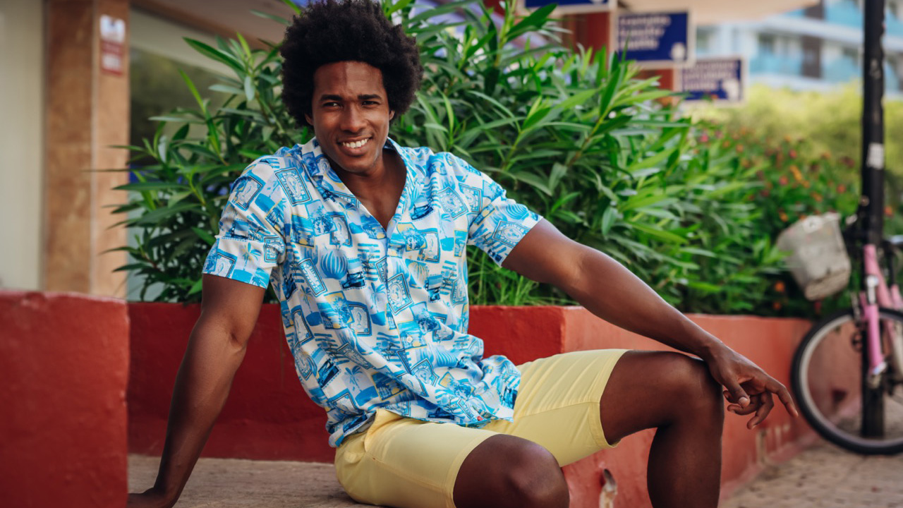
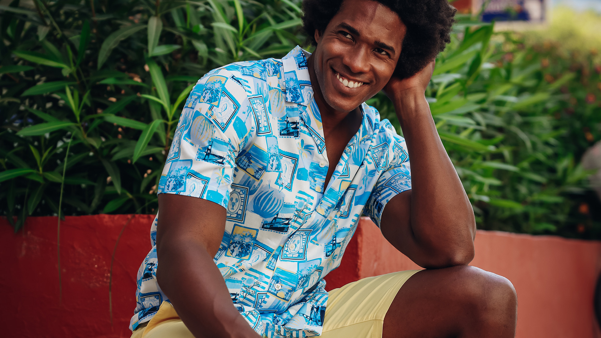
For this exclusive print design, I partnered with A Fish Named Fred to create a California-inspired all-over patternthat blends illustration, coastal culture, and fashion versatility.

The concept:
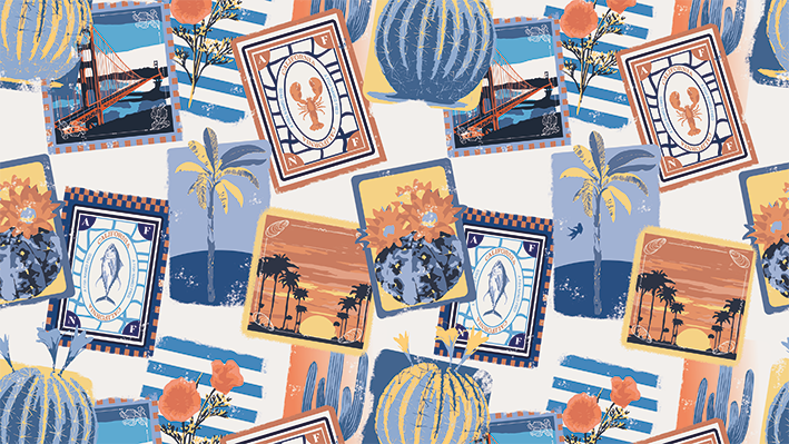
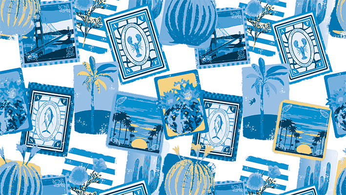
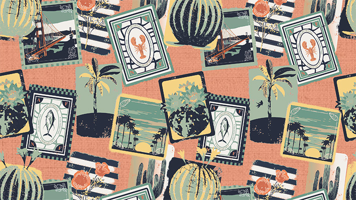
A sunny, dreamlike textile covered in vintage-style postcards and postage stamps, showing scenes and symbols from California's coastlines and cities—reimagined with a British-style brush effect and brought to life with soft yet vibrant colors.

This print became part of Fred’s Spring/Summer collection, applied across casual shirts and statement pieces for retail and showroom use.

Print Story & Elements

Each element in the design tells a piece of California’s story—drawn, textured, and arranged in a flowing layout that feels nostalgic yet modern.

Illustrated Icons Included:

  • Coastal fish native to the California Pacific
  • Palm trees from the Hollywood Hills
  • The iconic Golden Gate Bridge
  • Native Californian flowers
  • Postcards & vintage postage stamps with a travel-retro vibe

All drawn in a painterly, slightly faded British-influenced brush style, giving the print a worn-in, vacation-ready aesthetic.

Color Variants

White Background Variant

  • Base: White
  • Accents: Coral, Soft Yellow, Light Blue, Dark Blue
  • Feel: Crisp, fresh, and perfect for summer drops and short-sleeve shirts

Coral Background Variant

  • Base: Coral
  • Accents: Light Green, Soft Yellow, White, Dark Blue, Red
  • Feel: More expressive and bold—great for resortwear and pop pieces

Cool Coastal Variant

  • Base: White
  • Accents: Light Blue, Dark Blue, Soft Blue, Soft Yellow
  • Feel: Balanced and wearable—clean enough for dressier cuts or smart casual pieces

COLOR VARIANTS

What I Delivered

  • Full repeat tile (seamless, scalable)
  • Multi-variant color packs for digital textile printing
  • Garment-ready files for Fred’s apparel team
  • Print test swatches + application mockups
  • Final approval layout for factory use (pattern alignment & sizing guide)

Why This Print Works

✔️ Evokes travel and nostalgia in a totally fresh way
✔️ Combines detailed illustration with lifestyle wearability
✔️ Multiple color options made it versatile for styling and SKU development
✔️ Perfectly on-brand for Fred — quirky, bold, and full of story

What I Learned

This was a reminder of how a great print is also a narrative.

This project taught me to:

  • Combine regional storytelling with textile functionality
  • Design multiple variants while preserving design integrity
  • Create art that feels like vacation but sells like fashion
  • Trust subtle brush detail to give prints timeless texture

brand-img
logovector-imgellipsebrand-img

Let’s talk

Need to brainstorm, learn more about advertising, or explore how we can collaborate? Schedule a Meeting now. Select a date and time for a video call or an in-
person meeting with one of Our Team members.

Contact Us
Thank you! Your submission has been received!
Oops! Something went wrong while submitting the form.
Thank you! Your submission has been received!
Oops! Something went wrong while submitting the form.
ellipselogo
back to top