HomeServicesProjectsabout usContactmenu
Branding & Visual Identity

Logo Design for Luckybird — Amsterdam-Based Flight School Startup

Project Details

Luckybird is a newly launched flight school based in Amsterdam, focused on making private aviation more accessible and inspiring the next generation of pilots. As a startup, they needed a visual identity that felt approachable, fresh, and aspirational—something that captured the freedom of flight, but also the clarity and professionalism of aviation.

They trusted me to create their first-ever logo, laying the foundation for a bold, memorable brand.

Phase 1 – First Logo Design

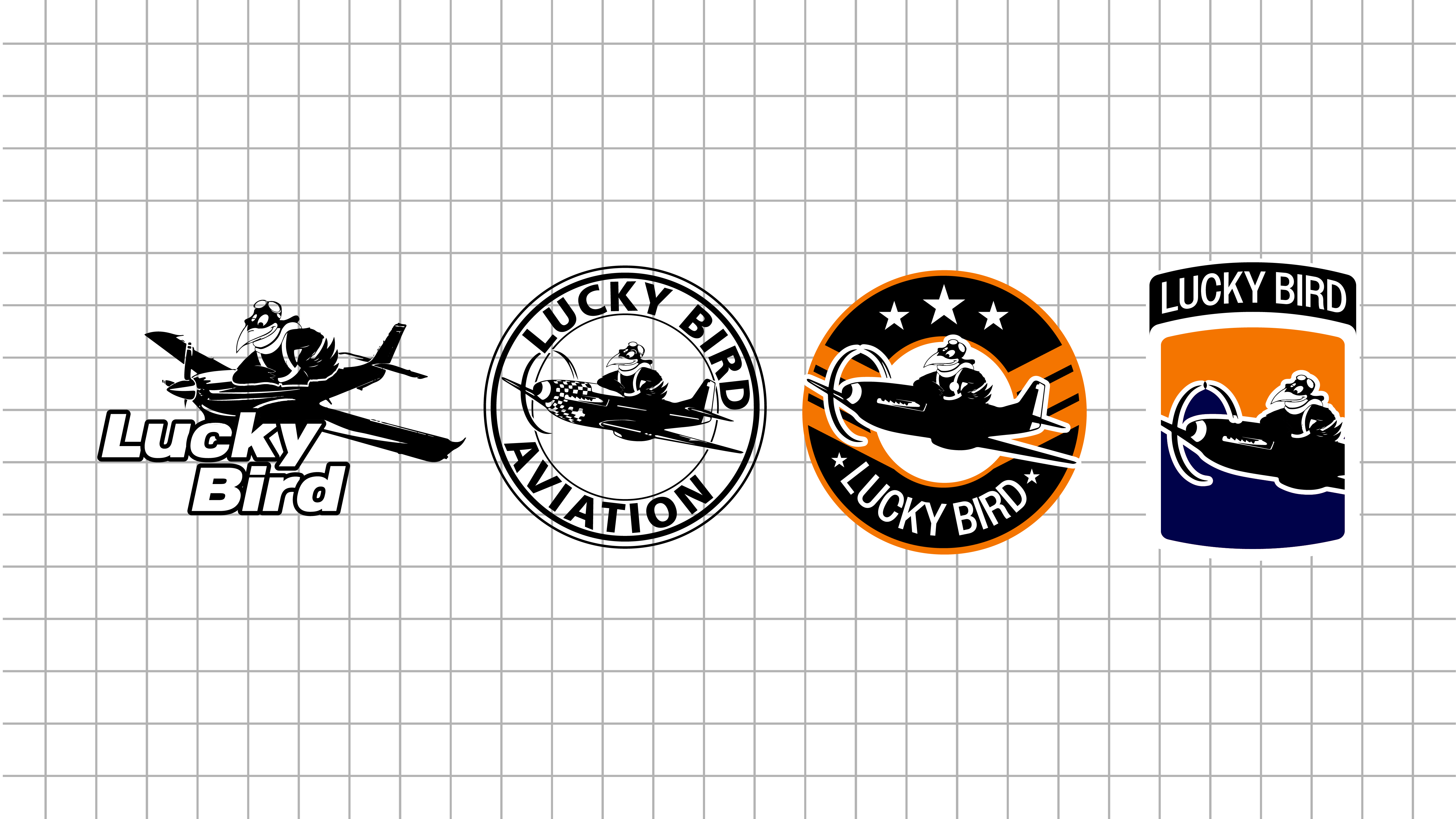
The first step was to explore the core themes of the brand:

  • Flight & freedom
  • Optimism
  • Simplicity
  • Professionalism

In this early stage, I created several concept directions:

  • Wordmark with subtle wing or flight motifs
  • Geometric bird symbols with upward motion
  • Minimalist line art inspired by runways, navigation, and takeoff paths

I shared initial sketches and vector drafts with the founders, focusing on clean, modern options that avoided aviation clichés while staying readable and future-proof.

🔍 Goal of Phase 1: Generate a visual language that reflects the name “Luckybird” while keeping the design open, scalable, and professional.

Phase 2 – Refinement & Direction

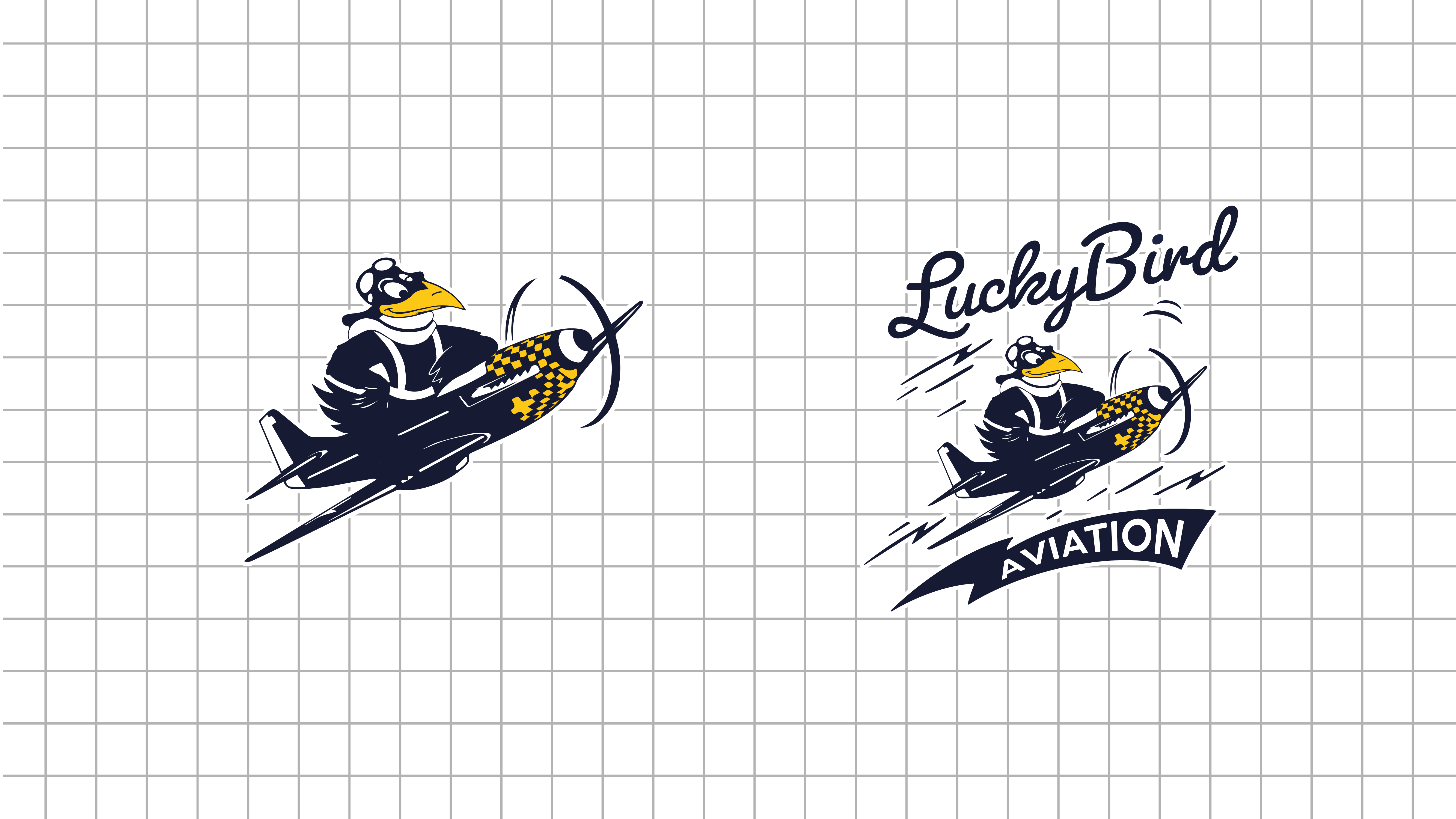
In Phase 2, we selected one primary direction:
A stylized bird-in-flight symbol, shaped with upward geometry to symbolize ambition and movement.

What we worked on during this phase:

  • Refining the bird icon to feel more aerodynamic and distinct
  • Typography pairing: exploring rounded sans-serif vs. sharp geometric fonts
  • Color palette exploration: calming aviation blues, uplifting accents, high contrast for cockpit/digital legibility
  • Testing across uses: we mocked up the logo on aircraft tails, flight suits, mobile apps, and signage

We also discussed QR code integration, submark variants (for social or stickers), and placement on plane fuselage and uniforms.

🔍 Goal of Phase 2: Nail down the logo form, ensure versatility, and align it with the real-world branding needs of a flight school.

Final Phase – Delivery & Brand System

The final logo delivered:

  • A modern, clean symbol: the “Luckybird” birdmark doubled as both a bird in motion and a subtle arrow pointing upward.
  • A custom wordmark with refined letter spacing, usable both with and without the icon.
  • A flexible system: full logo, stacked version, icon-only, and dark/light variants.
  • A style guide: brand colors, typography rules, clear-space guidelines, and example use cases.

We optimized for:

  • Embroidery (flight uniforms)
  • Vinyl (aircraft decals)
  • Digital (mobile-first visibility, favicons, and QR-adjacent placement)

What We Learned

This project reinforced a few key branding truths:

  • Logo design is never just visual—it’s strategic. The identity must scale with the company’s ambitions.
  • Startup clients need clarity and confidence—this means helping them see how their logo lives in the real world.
  • Simple wins, when done well—the Luckybird mark is clean, distinct, and recognizable at a glance.
  • Trust builds better design—the founders gave me creative freedom, and that made the result stronger.

Coming Soon

Luckybird’s website and flight training platform will launch later this year. Stay tuned for brand rollout and flight school details.

Let’s talk

Need to brainstorm, learn more about advertising, or explore how we can collaborate? Schedule a Meeting now. Select a date and time for a video call or an in-
person meeting with one of Our Team members.

Contact Us
Thank you! Your submission has been received!
Oops! Something went wrong while submitting the form.
Thank you! Your submission has been received!
Oops! Something went wrong while submitting the form.
ellipselogo
back to top